[CSS] display: flex (flexbox) 정리
flexbox의 등장 배경
- 기존의 CSS 레이아웃 방법은 복잡하고 어려움
- 기존의 CSS 레이아웃 방법은 유연성이 부족
- 모바일 웹의 등장으로 유동적인 레이아웃이 필요
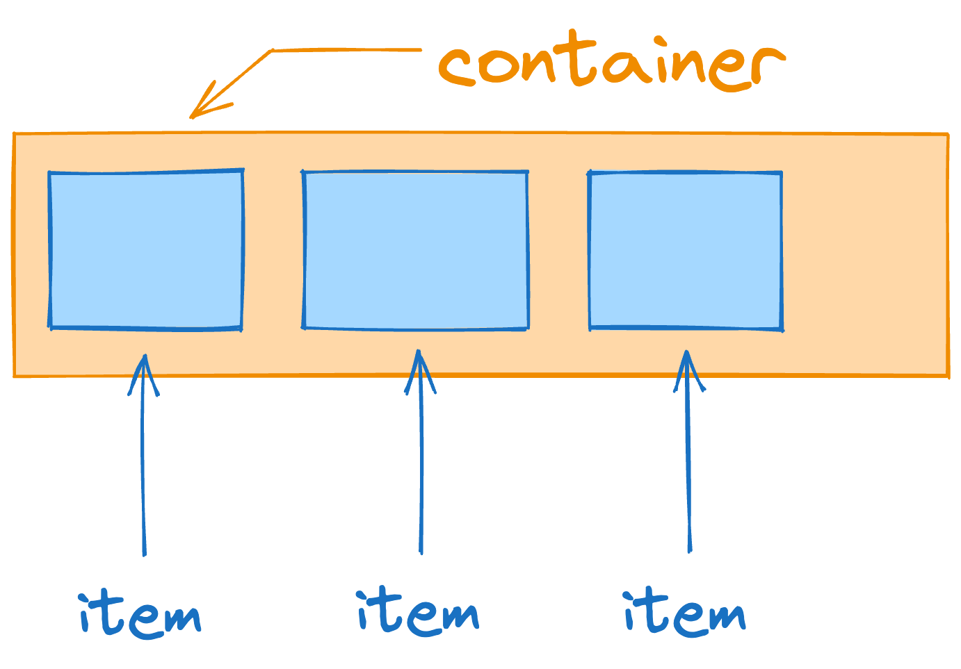
flexbox를 제외한 속성들로 아래 이미지 레이아웃을 코드로 작성해보자

<!DOCTYPE html>
<html lang="ko">
  <head>
    <meta charset="UTF-8" />
    <meta name="viewport" content="width=device-width, initial-scale=1.0" />
    <style>
      * {
        list-style: none;
        padding: 0;
        margin: 0;
      }
      header {
        background-color: gainsboro;
        padding: 0px 20px;
      }
      header .wrap {
        position: relative;
        line-height: 50px;
        text-align: center;
      }
      header .wrap .logo,
      header .wrap .login {
        position: absolute;
        top: 0;
        bottom: 0;
      }
      header .wrap .logo {
        left: 0;
      }
      header .wrap .login {
        right: 0;
      }
      header .wrap nav {
        display: inline-block;
      }
      header .wrap .menus li {
        display: inline-block;
        margin: 0 10px;
      }
      header a {
        color: #000;
        text-decoration: none;
      }
    </style>
  </head>
  <body>
    <header>
      <div class="wrap">
        <div class="logo"><a href="#">로고</a></div>
        <nav>
          <ul class="menus">
            <li><a href="#">MENU1</a></li>
            <li><a href="#">MENU2</a></li>
            <li><a href="#">MENU3</a></li>
          </ul>
        </nav>
        <div class="login">
          <a href="#">로그인</a>
        </div>
      </div>
    </header>
  </body>
</html>
위 코드가 정답은 아니지만 이렇게 간단한 레이아웃을 짜는데도 복잡해진다.
나중 flexbox를 배우고 난 이후에 해당 코드와 비교해보자.
TMI
나는 이전 회사가 지방자치단체, 교육기관 홈페이지 개발 위주였는데 퍼블리싱 할 때마다 flex를 못쓰게 해서(IE9까지 맞춰야 됨) 눈물 흘리면서 코드를 짰다. 반응형 들어갈 때는 콧물까지 흐른 기억이 난다.
flexbox의 기본 용어
flex-container: flex 속성을 갖는 요소로 flex 부모 요소
flex-items: flex 속성을 갖는 요소의 자식 요소들로 flex 자식 요소
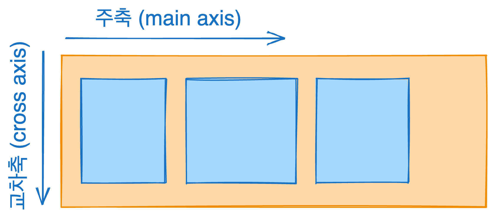
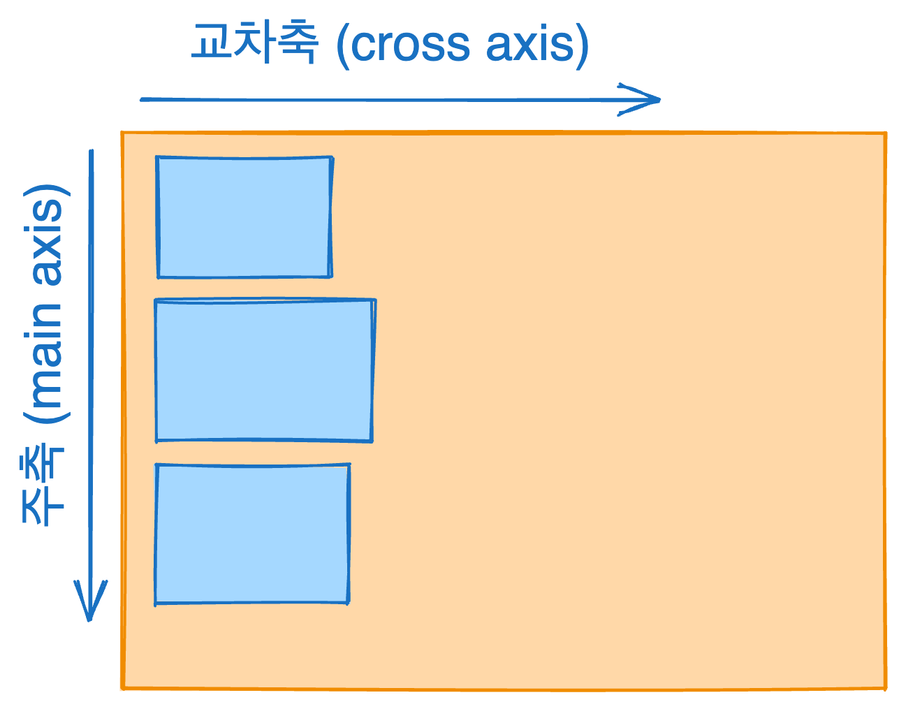
주축 (main axis): 아이템의 배치 방향의 축
교차축 (cross axis): 주축의 수직축
아래 이미지는 아이템들이 수평으로 있을 때 주축과 교차축
아래 이미지는 아이템들이 수직으로 있을 때 주축과 교차축
flexbox의 속성
flexbox 컨테이너에 적용하는 속성
flexbox 속성을 사용하기 위해선 우선 컨테이너에 display: flex를 설정해 주셔야 아래 속성들을 사용 가능합나다.
예시 코드
<!DOCTYPE html>
<html lang="ko">
  <head>
    <meta charset="UTF-8" />
    <meta name="viewport" content="width=device-width, initial-scale=1.0" />
    <title>Flex</title>
    <style>
      .container {
        background-color: skyblue;
        height: 100vh;
        display: flex;
        /* 여기에 아래 속성들 들어갈 자리 */
      }
      .container .item {
        width: 80px;
        height: 80px;
        line-height: 80px;
        text-align: center;
        color: #000;
      }
      .container .item1 {
        background-color: red;
      }
      .container .item2 {
        background-color: orange;
      }
      .container .item3 {
        background-color: yellow;
      }
      .container .item4 {
        background-color: green;
      }
      .container .item5 {
        background-color: blueviolet;
      }
    </style>
  </head>
  <body>
    <div class="container">
      <div class="item item1">1</div>
      <div class="item item2">2</div>
      <div class="item item3">3</div>
      <div class="item item4">4</div>
      <div class="item item5">5</div>
    </div>
  </body>
</html>
flex-direction
아이템들이 배치되는 방향을 설정 (주축 방향 설정)
- row(default): 수평 정렬 (좌 → 우)
- row-reverse: 수평 정렬 (우 → 좌)
- column: 수직 정렬(위 → 아래)
- column-reverse: 수직 정렬 (아래 → 위)
justify-content
주축을 따라 아이템들을 어떻게 정렬할지 설정
- flex-start(default): 아이템들을 시작점으로 정렬
- flex-direction 속성이 row(수평)일 때는 왼쪽, column(수직)일 때는 위
- flex-end: 아이템들을 끝점으로 정렬
- flex-direction이 row(수평)일 때는 오른쪽, column(수직)일 때는 아래
- center: 아이템들을 가운데로 정렬
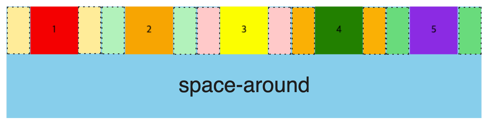
- space-between: 양쪽 여백을 없애고 나머지 아이템들이 공간을 나누어 갖는다.
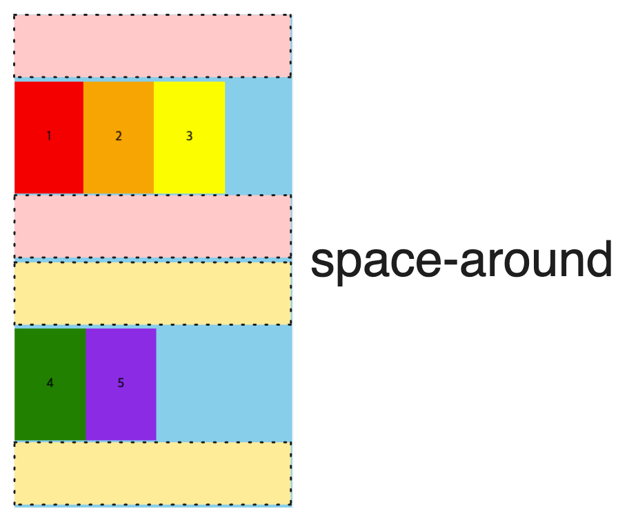
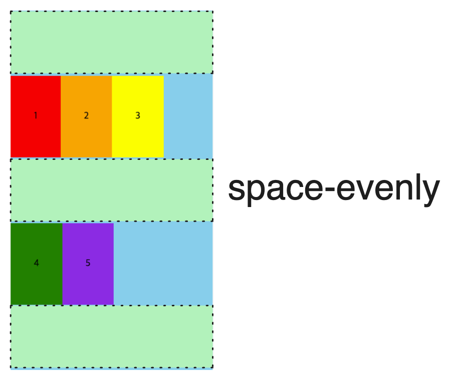
- space-around: 아이템들의 여백을 모두 공평하게 나누어 갖는다.
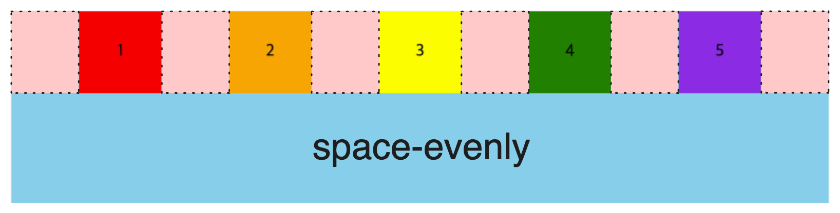
- space-evenly: 모든 아이템들의 간격이 일정
space-around와 space-evenly의 차이점
align-items
교차 축을 따라 아이템들을 어떻게 정렬할지 설정
- stretch(default): 아이템 크기 설정이 없으면 부모 요소의 세로 크기를 따라 확장
- flex-start: 아이템들을 시작점으로 정렬
- flex-direction 속성이 row(수평)일 때는 위, column(수직)일 때는 왼쪽
- flex-end: 아이템들을 끝점으로 정렬
- flex-direction이 row(수평)일 때는 아래, column(수직)일 때는 오른쪽
- center: 아이템들을 가운데로 정렬
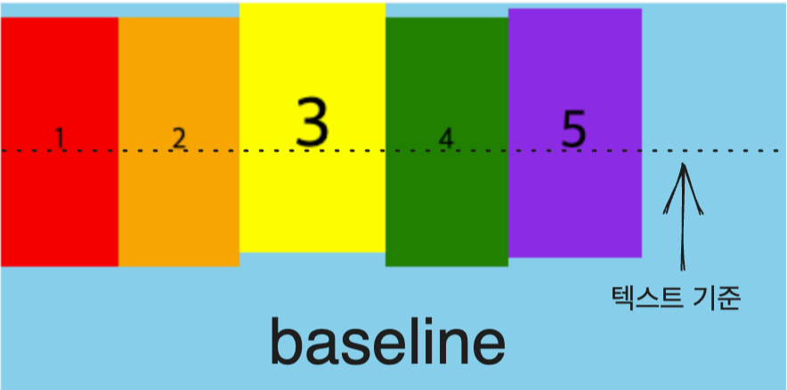
- baseline: 아이템 텍스트 baseline 기준으로 정렬
baseline 이해하기 쉬운 이미지
flex-wrap
컨테이너(부모)가 한 줄에 아이템을 다 수용하지 못할 때, 줄바꿈 관련 설정
- nowrap(default): 줄 바꿈 하지 않고 넘치면 삐져 나감
- wrap: 넘치면 줄 바꿈함
- wrap-reverse: 넘치면 역순으로 줄 바꿈
wrap, wrap-reverse에서 드래그바를 움직여 보세요.
align-content
여러 줄이 있을 때 교차 축을 따라 줄들을 어떻게 정렬할지 설정 (두 줄 이상 이루어진 플렉스 컨테이너에만 적용)
※ 여러 줄일 경우 align-items 속성 대신 align-content 속성이 적용된다.
- stretch(default): 아이템 크기 설정이 없으면 부모 요소의 세로 크기를 따라 확장
- flex-start: 아이템들을 시작점으로 정렬
- flex-direction 속성이 row(수평)일 때는 위, column(수직)일 때는 왼쪽
- flex-end: 아이템들을 끝점으로 정렬
- flex-direction이 row(수평)일 때는 아래, column(수직)일 때는 오른쪽
- center: 아이템들을 가운데로 정렬
- space-between: 양쪽 여백을 없애고 나머지 아이템들이 공간을 나누어 갖는다.
- space-around: 아이템들의 여백을 모두 공평하게 나누어 갖는다.
- space-evenly: 모든 아이템들의 간격이 일정
space-around와 space-evenly의 차이점
Tip. flex에서 아이템 사이 간격 주는 방법
column-gap: 수평일 때 아이템 사이 여백 사이즈를 줄 수 있다.
row-gap: 수직일 때 아이템 사이 여백 사이즈를 줄 수 있다.
※ margin처럼 아이템 양끝 여백을 신경 안 써도 된다.
예시 코드
<!DOCTYPE html>
<html lang="ko">
  <head>
    <meta charset="UTF-8" />
    <meta name="viewport" content="width=device-width, initial-scale=1.0" />
    <title>Flex</title>
    <style>
      .container {
        display: flex;
        background-color: skyblue;
        height: 300px;
      }
      .container .item {
        width: 80px;
        height: 80px;
        line-height: 80px;
      }
      .container .item1 {
        background-color: blue;
      }
      .container .item2 {
        background-color: green;
      }
      .container .item3 {
        background-color: red;
      }
      .container1 {
        flex-direction: row;
        column-gap: 20px;
      }
      .container2 {
        flex-direction: column;
        row-gap: 20px;
      }
    </style>
  </head>
  <body>
    <p>flex-direction: row;</p>
    <div class="container container1">
      <div class="item item1"></div>
      <div class="item item2"></div>
      <div class="item item3"></div>
    </div>
    <p>flex-direction: column;</p>
    <div class="container container2">
      <div class="item item1"></div>
      <div class="item item2"></div>
      <div class="item item3"></div>
    </div>
  </body>
</html>
아래는 연습을 위해 flexbox 컨테이너 속성을 모아놓았습니다.
stretch 효과를 보기위해 아이템들 사이즈는 설정을 안했습니다.
헷갈리시면 아이템 사이즈 설정을 체크해 주세요 !
-
flex-direction:
-
justify-content:
-
align-items:
-
flex-wrap:
-
align-content:
flexbox 아이템에 적용하는 속성
아이템에 적용하는 속성은 아이템 전체로 주거나 아이템 한 개씩 컨트롤을 할 수 있다.
예시 코드
<!DOCTYPE html>
<html lang="ko">
  <head>
    <meta charset="UTF-8" />
    <meta name="viewport" content="width=device-width, initial-scale=1.0" />
    <title>Flex</title>
    <style>
      .container {
        background-color: skyblue;
        height: 100vh;
        display: flex;
      }
      .container .item {
        width: 80px;
        height: 80px;
        line-height: 80px;
        text-align: center;
        color: #000;
        /* 여기에 아래 속성들 들어갈 자리 */
      }
      .container .item1 {
        background-color: red;
      }
      .container .item2 {
        background-color: orange;
      }
      .container .item3 {
        background-color: yellow;
      }
      .container .item4 {
        background-color: green;
      }
      .container .item5 {
        background-color: blueviolet;
      }
    </style>
  </head>
  <body>
    <div class="container">
      <div class="item item1">1</div>
      <div class="item item2">2</div>
      <div class="item item3">3</div>
      <div class="item item4">4</div>
      <div class="item item5">5</div>
    </div>
  </body>
</html>
flex-basis
Flex 아이템의 기본 크기를 설정 (flex-direction이 row일 때는 너비, column일 때는 높이)
- auto(default): 아이템의 원래 너비 적용
- content: 아이템의 크기는 내부 콘텐츠의 크기에 따라 결정
- px, %, em 등
예시 코드
<!DOCTYPE html>
<html lang="ko">
  <head>
    <meta charset="UTF-8" />
    <meta name="viewport" content="width=device-width, initial-scale=1.0" />
    <title>Flex</title>
    <style>
      .container {
        background-color: skyblue;
        display: flex;
        height: 300px;
      }
      .container .item {
        width: 80px;
        height: 80px;
        line-height: 80px;
        text-align: center;
        color: #000;
      }
      .container .item1 {
        background-color: red;
        flex-basis: 400px;
      }
      .container .item2 {
        background-color: orange;
        flex-basis: 200px;
      }
      .container .item3 {
        background-color: yellow;
        flex-basis: auto;
      }
    </style>
  </head>
  <body>
    <div class="container">
      <div class="item item1">1</div>
      <div class="item item2">2</div>
      <div class="item item3">3</div>
    </div>
  </body>
</html>
결과 화면
flex-grow
자식 요소가 적거나 크기가 작아 컨테이너에 공간이 남을 때 빈 공간을 메울만큼 늘어나도록 설정하는 속성
- 0(default): 아이템의 원래 너비 적용
- 양수: 해당 아이템이 유연한(Flexible) 박스로 변하고 원래의 크기보다 커지며 빈 공간을 메우게 됨
응용 코드 (아이템 개별 속성 지정)
<!DOCTYPE html>
<html lang="ko">
  <head>
    <meta charset="UTF-8" />
    <meta name="viewport" content="width=device-width, initial-scale=1.0" />
    <title>Flex</title>
    <style>
      .container {
        background-color: skyblue;
        height: 300px;
        display: flex;
      }
      .container .item {
        width: 80px;
        height: 80px;
        line-height: 80px;
        text-align: center;
        color: #000;
      }
      .container .item1 {
        background-color: red;
        flex-grow: 1;
      }
      .container .item2 {
        background-color: orange;
        flex-grow: 2;
      }
      .container .item3 {
        background-color: yellow;
        flex-grow: 3;
      }
    </style>
  </head>
  <body>
    <div class="container">
      <div class="item item1">1</div>
      <div class="item item2">2</div>
      <div class="item item3">3</div>
    </div>
  </body>
</html>
결과 화면 (1:2:3 비율로 커짐)
flex-shrink
아이템들이 컨테이너 내에서 사용 가능한 공간보다 작을 때 어떻게 줄어들지를 결정하는 데 사용
- 1(default): 모든 아이템들이 동등하게 줄어든다.
- 0: 해당 아이템은 줄어들지 않는다.
- 일반적으로 아이템이 컨테이너의 사용 가능한 공간보다 크기를 유지해야 하는 경우에 유용
- 양수: 아이템이 줄어드는 비율
예시 코드
<!DOCTYPE html>
<html lang="ko">
  <head>
    <meta charset="UTF-8" />
    <meta name="viewport" content="width=device-width, initial-scale=1.0" />
    <title>Flex</title>
    <style>
      .container {
        background-color: skyblue;
        display: flex;
        height: 300px;
      }
      .container .item {
        flex-basis: 100px;
        height: 80px;
        line-height: 80px;
        text-align: center;
        color: #000;
      }
      .container .item1 {
        background-color: red;
        flex-shrink: 1;
      }
      .container .item2 {
        background-color: orange;
        flex-shrink: 2;
      }
      .container .item3 {
        background-color: yellow;
        flex-shrink: 0;
      }
    </style>
  </head>
  <body>
    <div class="container">
      <div class="item item1">1</div>
      <div class="item item2">2</div>
      <div class="item item3">3</div>
    </div>
  </body>
</html>
결과 화면 (드래그바를 이용해 컨테이너 사이즈를 줄여보세요.)
flex
flex-grow, flex-shrink, flex-basis 속성을 한 줄에 축약해서 사용할 수 있도록 해주는 단축 속성 (순서 지켜야 함)
- flex-grow flex-shrink flex-basis;
- Ex) flex: 1 0 100px;
- /* flex-grow: 1, flex-shrink: 0, flex-basis: 100px; */
flex-basis, flex-grow, flex-shrink 속성은 저도 잘 써보지 않아서 설명이 좀 미흡하네요 ㅠ
나중에 개념이 좀 더 잡히면 내용을 추가하도록 하겠습니다~!
order
각 아이템들의 시각적 나열 순서를 결정하는 속성
※ 참고 : order 속성을 사용하면 실제 DOM 순서와 화면에 보여지는 콘텐츠의 순서가 서로 연결되지 않기 때문에, 시각으로 스크린 리더 등 보조 기술을 사용해 이동하는 사용자의 경험에 부정적인 영향을 줄 수 있음
- 0(default): 순서를 바꾸지 않음
- 양수: 원하는 순서를 지정
- 음수: 좌측으로 자리를 바꾸는 횟수
예시 코드
<!DOCTYPE html>
<html lang="ko">
  <head>
    <meta charset="UTF-8" />
    <meta name="viewport" content="width=device-width, initial-scale=1.0" />
    <title>Flex</title>
    <style>
      .container {
        background-color: skyblue;
        display: flex;
        height: 300px;
      }
      .container .item {
        width: 80px;
        height: 80px;
        line-height: 80px;
        text-align: center;
        color: #000;
      }
      .container .item1 {
        background-color: red;
        order: 1;
      }
      .container .item2 {
        background-color: orange;
        order: 0;
      }
      .container .item3 {
        background-color: yellow;
        order: -1;
      }
    </style>
  </head>
  <body>
    <div class="container">
      <div class="item item1">1</div>
      <div class="item item2">2</div>
      <div class="item item3">3</div>
    </div>
  </body>
</html>
결과 화면
align-self
자식 요소 중 선택된 항목에 대해서만 교차축으로 다시 정렬하는 속성
- auto(default): align-items 설정을 상속
- stretch: 아이템 크기 설정이 없으면 부모 요소의 세로 크기를 따라 확장
- flex-start: 아이템을 시작점으로 정렬
- flex-direction 속성이 row(수평)일 때는 위, column(수직)일 때는 왼쪽
- flex-end: 아이템을 끝점으로 정렬
- flex-direction이 row(수평)일 때는 아래, column(수직)일 때는 오른쪽
- center: 아이템을 가운데로 정렬
- baseline: 아이템 텍스트 baseline 기준으로 정렬
예시 코드
<!DOCTYPE html>
<html lang="ko">
  <head>
    <meta charset="UTF-8" />
    <meta name="viewport" content="width=device-width, initial-scale=1.0" />
    <title>Flex</title>
    <style>
      .container {
        background-color: skyblue;
        display: flex;
        height: 300px;
      }
      .container .item {
        padding: 30px;
        text-align: center;
        color: #000;
      }
      .container .item1 {
        background-color: red;
      }
      .container .item2 {
        background-color: orange;
        align-self: center;
      }
      .container .item3 {
        background-color: yellow;
      }
    </style>
  </head>
  <body>
    <div class="container">
      <div class="item item1">1</div>
      <div class="item item2">2</div>
      <div class="item item3">3</div>
    </div>
  </body>
</html>
결과 화면
이제 처음에 보았던 이미지를 flex를 이용하여 만들어 보자.

<!DOCTYPE html>
<html lang="ko">
  <head>
    <meta charset="UTF-8" />
    <meta name="viewport" content="width=device-width, initial-scale=1.0" />
    <style>
      * {
        list-style: none;
        padding: 0;
        margin: 0;
      }
      header {
        background-color: gainsboro;
        padding: 0px 20px;
        height: 50px;
        display: flex;
        justify-content: space-between;
        align-items: center;
      }
      header .menus {
        display: flex;
        column-gap: 20px;
      }
      header a {
        color: #000;
        text-decoration: none;
      }
    </style>
  </head>
  <body>
    <header>
      <div class="logo"><a href="#">로고</a></div>
      <nav>
        <ul class="menus">
          <li><a href="#">MENU1</a></li>
          <li><a href="#">MENU2</a></li>
          <li><a href="#">MENU3</a></li>
        </ul>
      </nav>
      <div class="login">
        <a href="#">로그인</a>
      </div>
    </header>
  </body>
</html>
코드 비교
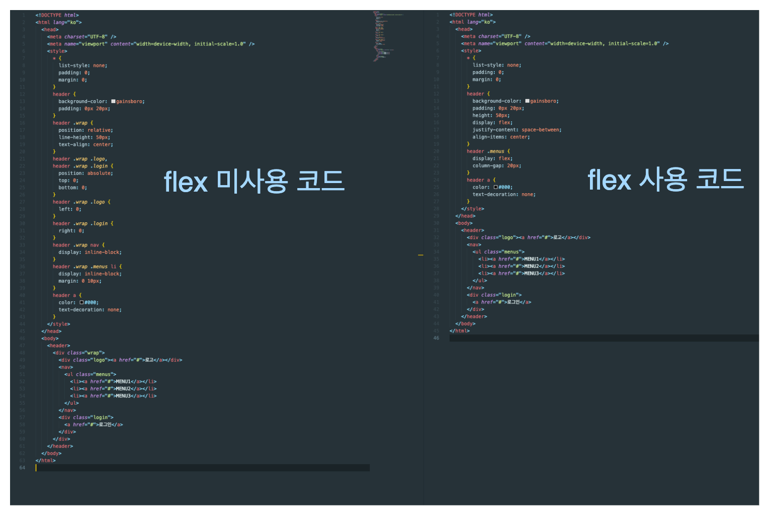
코드가 잘 보이진 않는데 얼핏 봐도 코드가 훨씬 짧아지고 가독성도 좋아진다.
결론 : flex, grid는 필수로 배우도록 하자 !!